
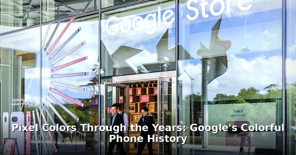
Let’s face it: smartphones are pretty boring these days. Same black rectangles, same rounded corners. So, what makes a phone stand out? The software, sure, but also – and perhaps more visually – the color. And nobody, I mean nobody, does color quite like Google with their Pixel phones. They’re not just black, white, or silver; they’re “Kinda Blue,” “Oh So Orange,” and “Really Blue.” Over the years, the creative Pixel colors have become a hallmark of the Google Pixel brand. They’re fun, memorable, and often surprisingly stylish. Let’s take a trip down memory lane and revisit some of the most iconic and interesting shades that have graced Google’s smartphones.
A Colorful History of Pixel Design
Google’s initial vision for Pixel phones was pretty clear: simplicity and user-friendliness. But that didn’t mean boring! They wanted to create phones that were both powerful and approachable, and the design played a huge role in that. Early Pixel phones prioritized function over form, but as the line matured, aesthetics became increasingly important. Color, of course, is a huge part of that. Google has consistently used color to inject personality into its phones, making them more than just soulless gadgets.
Consider the materials. We’ve seen aluminum, glass, and even a textured finish on the Pixel line. Each material interacts with color differently, creating unique visual effects. The matte finish on the Pixel 4, for example, gave the colors a softer, more subdued look compared to the glossy finishes of earlier models. And the names! Oh, the names. “Clearly White,” “Really Blue,” “Not Pink” – they’re playful and memorable. They’re not just trying to sell you a phone; they’re trying to sell you a vibe. It’s a smart way to differentiate the Pixel line from a sea of competitors. These aren’t just “blue phones,” they’re “Really Blue” phones. You might also enjoy: PS5, PS4 Games This Week: New Releases (Feb 23rd-Mar 1st). You might also enjoy: Pokémon FireRed & LeafGreen on Switch: A Visual Wishlist.
Naming Conventions: More Than Just a Color
Those names? They matter. “Clearly White” is straightforward, but “Kinda Blue”? That hints at something more subtle, more nuanced. It’s not just about the color itself, but the feeling it evokes. And let’s be honest, who wouldn’t want a phone that’s “Oh So Orange”? It’s a declaration of personality, a way to say, “I’m not afraid of a little color!”
The OG Pixels: A Study in Subtlety (Mostly)
The original Pixel and Pixel XL were, shall we say, understated in their design. Google played it safe with the initial color options. But they also threw in a curveball. The standard options were “Clearly White” and “Quite Black.” Safe, reliable, and… well, a bit boring. But then there was “Really Blue.”
Clearly White and Quite Black: The Classics
These were your bread-and-butter options. Clean, simple, and professional. They were designed to appeal to the widest possible audience. And, honestly, they looked pretty good. The contrast between the glass top portion and the aluminum body was subtle but effective. You couldn’t go wrong with these colors. But you also weren’t exactly turning any heads.
Really Blue: The Bold Statement
Now, this was interesting. “Really Blue” was a limited-edition color that was only available for a short time. It was a bold move for Google, signaling that they were willing to take risks with their design. And it paid off! “Really Blue” became an instant classic, and it’s still sought after by collectors today. It was a signal that Google wasn’t afraid to be different. Good for them.
Pixel 2: Hello, Panda!
Real talk: With the Pixel 2 and 2 XL, Google started to experiment even more with color and design. They introduced some truly memorable colorways, including the iconic “Black and White,” affectionately nicknamed “Panda” by fans. This phone was a clear step up in terms of design. It felt more refined, more polished, and the colors were a big part of that.
Black and White (Panda): The People’s Champion
The “Panda” Pixel 2 XL is arguably one of the most recognizable Pixel phones ever made. The black top portion and white bottom portion created a striking contrast that was instantly appealing. It was a bold and playful design that stood out from the crowd. And the nickname? Pure genius. It’s the power of good design and clever marketing. I still see people rocking this phone, and it still looks great!
Kinda Blue: Sophistication Personified
“Kinda Blue” was another standout color option for the Pixel 2. It was a muted, sophisticated blue that was both understated and elegant. Thing is, it wasn’t as flashy as “Really Blue,” but it had its own unique charm. This color was perfect for those who wanted something a little different without being too over-the-top. It was the color of quiet confidence. Understated power.
Clearly White and Just Black: Refining the Familiar
Of course, Google also offered “Clearly White” and “Just Black” options for the Pixel 2. But these weren’t just rehashes of the original Pixel colors. They were slightly tweaked and refined, with a more premium feel. They were the reliable workhorses of the Pixel 2 lineup. Solid choices for those who preferred a more classic look.

Pixel 3: Frosted Fun
The Pixel 3 and 3 XL brought a new level of refinement to the Pixel design. Google introduced a frosted glass back, which gave the phones a more premium feel and also affected the way the colors looked. It was a subtle but significant change that elevated the overall design. Plus, the “Not Pink” color was a stroke of genius. I mean, come on, “Not Pink”? Brilliant!
Not Pink: Unforgettable
Let’s be honest, “Not Pink” is one of the most memorable Pixel colors ever. It was a pale, almost peachy pink that was both unique and surprisingly versatile. It wasn’t your typical girly pink; it was a more sophisticated and understated shade. It was a color that defied expectations and made a statement. Good job, Google. Good job.
Pixel 4: Oh So Orange!
With the Pixel 4 and 4 XL, Google continued to push the boundaries of Pixel design. The introduction of the “Oh So Orange” color was a bold move, and the matte finish gave the colors a softer, more muted look. And that orange power button? Chef’s kiss. It was a small detail that made a big difference.
Oh So Orange: A Burst of Energy
Real talk: That orange, though! “Oh So Orange” was a vibrant and energetic color that was impossible to ignore. It was a statement piece, a way to show off your personality. The matte finish gave it a unique texture and made it feel great in the hand. And that orange power button? It was the perfect finishing touch, a small detail that tied the whole design together.
Beyond the Basics: Limited Editions and Lasting Impact
Throughout the Pixel’s history, Google has released a number of limited-edition colorways that have become highly sought after by collectors. These colors are often only available for a short time, making them even more desirable. And let’s not forget the impact that color has on resale value. A rare or popular color can significantly increase the value of your phone, especially if it’s in good condition.
So, which Pixel color is the most iconic? That’s a tough question. “Really Blue” was a bold statement, “Panda” was instantly recognizable, and “Oh So Orange” was a burst of energy. But ultimately, it comes down to personal preference. What’s YOUR favorite Pixel color? I’m genuinely curious. Pretty wild, right?
Look, Consider this: color is more than just a cosmetic choice. It’s a way to express yourself, to make a statement, and to stand out from the crowd. Google understands this, and they’ve consistently used color to create Pixel phones that are both beautiful and unique. What will they come up with next? I can’t wait to see. Let me know what your favorite color is – or what color you wish they’d make – on Twitter!
Frequently Asked Questions
Why are Pixel phones known for their colors?
Google often uses unique and memorable names and shades for its Pixel phones, making them stand out from the competition. The company has experimented with various finishes, from glossy to matte, further enhancing the visual appeal of each colorway.
Which Pixel phone had the ‘Panda’ color?
The Pixel 2 and Pixel 2 XL featured the “Black and White” color, affectionately nicknamed “Panda” by fans due to its white back and black top portion. It was – and remains – a truly iconic Google Pixel design.
Do Pixel colors affect the phone’s price?
Limited edition or particularly popular Pixel colors can sometimes command a higher resale value, especially if they’re in good condition and highly sought after by collectors. It’s like a rare baseball card… but a phone!